Colour your home happy
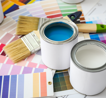
Would you want red walls in the kids’ room? A shiny black bathroom? If you find yourself reacting strongly to those suggestions, there’s a good reason.
Colour plays a big role in the home, as much about how we feel as how it looks. So, it is important to take colour psychology into consideration when choosing new paint for specific rooms.
Scientific tests have shown that when humans are exposed to different colours, our physical, mental and emotional states alter slightly. The effects can range from a physical change in blood pressure and body temperature, through to an alteration in our perception of space and distance. It has a marked influence on our mood and even our appetite.
When planning to paint a room, consider the occupants who will be affected; babies and very young children, for instance, will be more sensitive to the effects of colour than adults, so care should be taken when choosing a hue for their surroundings.
Many adults dislike purple, yet kids love it. The pale peach/pink of the womb is a baby’s first experience with colour, so using those hues for the nursery can help an infant relax and feel nurtured in its new environment.
Tone should always be factored into colour choice. Brighter hues will increase the impact of the colour, whereas those that are muted and ‘toned down’ tend to be more relaxing.
What colour is best for you?
Colours are generally either warm or cool. Warm hues (red, orange, yellow) have a range of effects from comfort to aggravation, while the cooler hues (blue, green, lavender, grey) can be anything from calming to depressing.
Cooler hues are good for rooms that get the hot western sun in the afternoon; warm hues are better for south-facing rooms.
• If your life is stressful, you might want to paint rooms where you rest and relax, such as the family room or bedroom, in pale blue or soft greens as they have a calming effect. Taupe will also create a tranquil environment, but with more warmth and cosiness.
• Like a splash of sunshine, yellow can lift the spirits and brighten your outlook, so to inject some energy and optimism into your surroundings, consider using yellow, apricot, cinnamon or tangerine.
• Many people instinctively reject the idea of black walls, but it can have an uplifting effect in the right space.
• Red is good in the kitchen and dining room as it increases the appetite. But beware, it has also been found to increase heartbeat and arouse passion or even aggression. Conversely, blue acts as an appetite suppressant so avoid it for the dining room.
• Greens are associated with food so are ideal for kitchens and dining rooms; lighter shades do well in offices and studies.
• Orange is a lively, welcoming colour: try it in entranceways and family rooms.
The reality of colour psychology is that there can be no generalisation, it still comes down to the individual. So before you rush out to buy your ideal shade of yellow for the conjugal bedroom, check with your partner first.
The safest way to introduce colour for effect might be in bed linen, curtains or cushions. Live with that a while and see how it affects everyone, before starting on the walls.
Likewise, try painting just a feature wall or inside a cupboard. Most importantly, have fun finding a colour scheme that expresses your personality and makes you feel good!